
The risk heat map. An industry staple for many years. The standard 3x3, or 5x5 risk chart heat map that has likelihood (or frequency) on one axis, impact (or magnitude) on the other, with colors ranging from green to red.
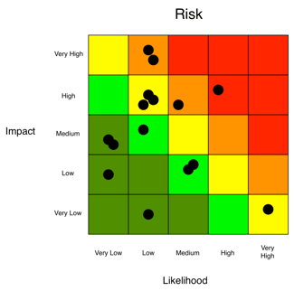 Anyone in risk management and cyber security might assume that this post will be an opportunity to rant about the many problems typically associated with the heat chart or risk matrix. From being inherently subjective, “How do you know that my orange risk is the same as your orange risk”? To…not fostering sound prioritization, “Which red risk is more red than the other reds?”
This may come as a shock to some, but as a means of communication, the heat chart does a pretty effective job of relaying which risks are of most concern to your audience. In a simplistic fashion, using stoplight colors that we all learned back in preschool (green, yellow, red), a risk analyst can quickly, and rather effectively communicate which risks are of most and least concern.
So why does the risk assessment heat map get such a bad rap, and more so, is it really deserved? The heat map has received a bad rap due to its association with poor risk assessment processes that rely more on subjectivity, feeling and a lack of critical thinking. As a result, the heat map is often a leading indicator of a more systemic concern about an organization’s risk management program.
But you can build a heat map on a solid foundation of objective, quantitative analysis. Here's how:
Step 1: Standard Risk Analysis Model
The first step is to get the organization to understand that the way they’ve been conducting risk assessments is at the root of the problem. The lack of a well thought-out, structured, and consistent approach leads them to a set of results that are more often than not inaccurate and indefensible.
To turn this around, we need to put in place its complete opposite: An industry vetted model that breaks down risk into its core components, increases consistency among analyses, fosters critical thinking and communication, as well as defensibility of results – in other words, Factor Analysis of Information Risk (FAIR™), the standard for quantification of cyber and technology risk.
Learn the fundamentals of FAIR risk analysis with training by the RiskLens Academy.
Or try it FREE with our Industry Cybersecurity Risk Report - See Your Industry's most common cybersecurity risks and financial impacts in this free report!
Add a few simple inputs and see how ransomware, insider error and other key events can impact your organization financially.
Step 2: Translation to Risk Scenario
The next step in the process would be to translate those “risks” identified in the heat map into risks--or loss events--in a FAIR sense. The items that typically show up in a heat map, or a risk register are often not loss events, but other components of the risk landscape (i.e., "Insider Threat" is better understood as a "Threat Community"; "Cloud" as an "Asset"; "Application Vulnerabilities" as a "Control Deficiency").
The approach here is to tease out and translate the organization’s concern, "Cloud", into a loss event or risk scenario: a threat actor causing a breach of sensitive customer information stored in the cloud. The translated statement is something we can tie a frequency and an impact (or loss magnitude) to, and thus perform a quantitative analysis.
Step 3: Risk Analysis Process
Following translation, we would then move into the phases of the risk analysis process, all of which are carried out through the RiskLens platform, built for implementing FAIR.
>>Scoping:
Take the translated statement and make sure we have a good understanding of the scenarios, asset(s), threat(s), effect(s), and, most importantly, loss event.
>>Data Gathering:
Collect and enter data from the organization’s subject matter experts or leverage sound industry data, taking advantage of the platform’s Data Helpers and loss tables.
>>Run/Refine:
Hit the run button on the RiskLens application, then review the results with a critical eye, ensuring they accurately reflect the problem being analyzed, along with all the information received along the way.
Step 4: Quantitative Risk Reporting with a Heat Map
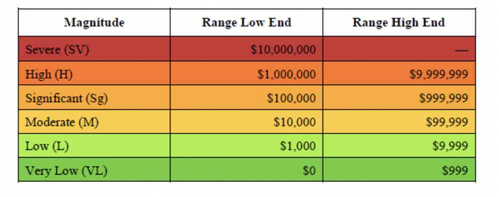
Although reporting is a key phase of the risk analysis process, it is broken out here to highlight the extra step of mapping quantitative ranges (based on the organization’s loss experience) to the colors that make up the heat map to infuse this communication tool with more objectivity (as in this example from the Open FAIR Standard):
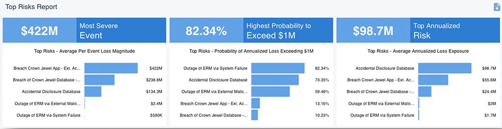
The RiskLens platform’s Rapid Risk Assessment capability quickly ranks an organization’s risks for probable loss exposure in dollars across several parameters:
It’s a simple next step to assign a color to a risk based on ranges of probable loss exposure, and plot risks on the heat map or other risk chart.
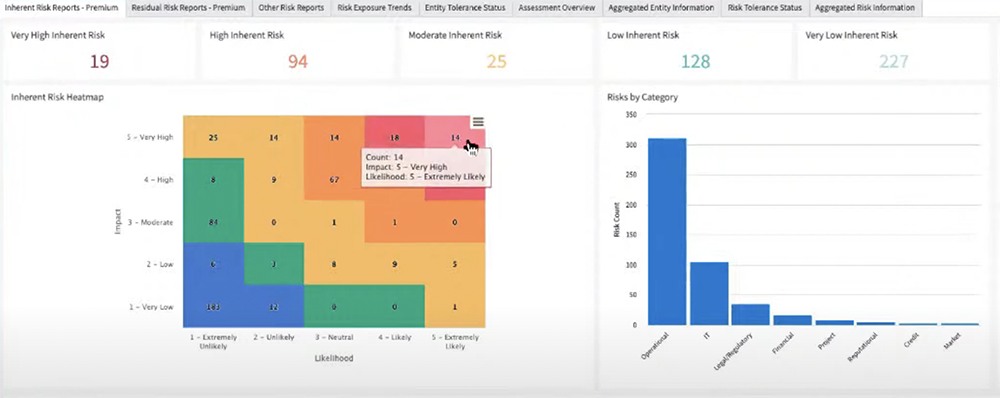
With the RiskLens data export API, the process can be automated, as in this example from the RiskLens integration with the ServiceNow GRC application. A GRC user imports RiskLens analyses into the application, assigns high-medium-low ranks, and ServiceNow renders the results in this risk register heat map.
Where previously we were not sure if one person’s red is the same as another, by mapping the colors to quantitative ranges, we increase the chances that all parties involved are on the same page when discussing the risk. Additionally, you provide your audience with a set of results that they’re familiar with, but this time around, they are backed by a sound, repeatable process.
RiskLens makes reporting on cyber and technology risk reliable, fast, and easy to grasp for business decision-makers. Contact us for a demo.
More on reporting on cyber risk assessments:
Quantitative Risk Reporting Stratification: Know Your Audience